COVID-19 surges in context
This page is intended as a resource to help BuzzFeed News reporters identify states where new COVID-19 cases seem to be surging and to put those numbers in context. The map and charts below will be updated daily.
The map comes from this post. States shown in darker pinks have had the biggest rise in new COVID-19 cases over the past 14 days.
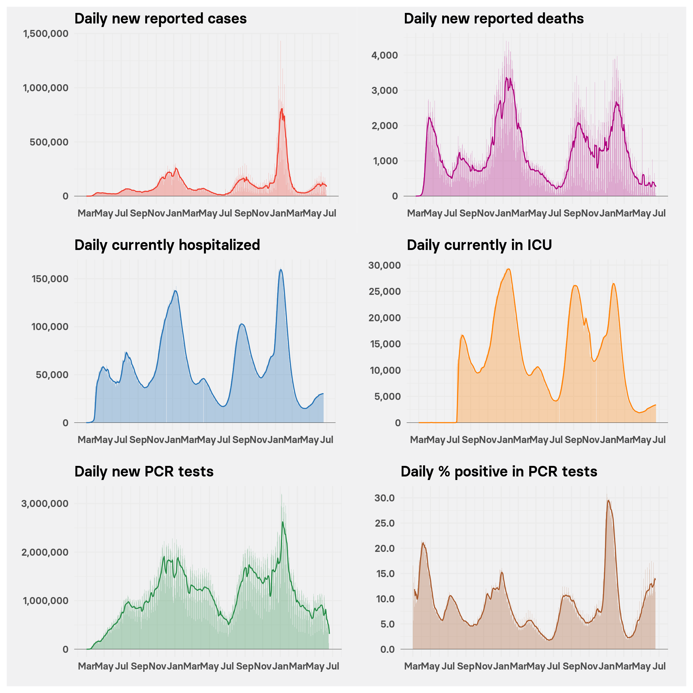
The charts beneath the map give a longer timeline of new COVID-19 cases and deaths per day, current numbers of patients hospitalized and in the ICU, plus data on new tests reported per day and the percentage positive in those tests. Use the dropdown menu to select the state you’re interested in. (Data on cases and deaths is compiled by the New York Times; data on hospitalization and testing comes from the federal Department of Health and Human Services.
The charts show daily totals plus a line giving 7-day rolling averages, to lessen the noise of day-to-day variation and show a clearer trajectory.
From the charts, you can see when a surge started and relate its timing to events such as moves to reopen states’ economies. This New York Times tracker is a good source of information on the the state of play with reopening and reversal of reopening by state.
Any major change in the spread of COVID-19 is likely to show in data on new cases 1-2 weeks later, because of the disease’s incubation period. Changes in deaths may lag 3-4 weeks behind a change in case numbers.
The charts can help distinguish between apparent surges driven largely by an increase in coronavirus testing from “real” surges that are causing an increase in hospitalization and severe illness requiring ICU beds.
Notes of caution and advice on interpretation
The data may have gaps and other problems, especially for testing. It's best to avoid quoting absolute numbers for testing, and to use those charts to assess trends. A rising percentage positive in testing, especially if associated with a rising number of tests, is a sign of escalating viral transmission. Be wary of apparent declines in testing in the most recent few days, which probably represent lags in reporting from states to the federal government. Data on COVID-19 patients in the ICU was not widely available before mid-July 2020; data on COVID-19 patients in the hospital may be incomplete for the first few months of the pandemic.
If you intend to cite any data from this page, if you have questions, or if you want a specific chart made for a story you are working on, contact Peter Aldhous.
Watch out, in particular, for abrupt rises or falls in any of the numbers. These often reflect changes in the way the data was recorded.